Digital Humanities Librarian

What is Constellate?
-
Constellateis an exploratory platform for text analysis that allows users to ingest data the from major collections from JSTOR, Portico, Chronicling America, DocSouth, and RevealDigital to get a birds eye view of primary and secondary sources' use of a particular concept or idea across a range of documents. You can build your own dataset to analyze using a range of quantitative metrics, or you can use it to test theories you might have about word use in practice in your given collection of documents.
The Constellate Landing Page
Constellate's landing page invites users to search their databases with the main search box.

In this box you could type any word you are interested in investigating. These could be any word which conveys meaning: 'baroque'. 'victorian', 'maxillofacial', 'Marxist', etc.
There are other options provided on this page. Much like with JSTOR - one of the partners on this project - you are invited to log in via your institution to access more data in the top right-hand corner. Also available for you in the top right hand of this landing page are:
Datasets takes you to your datasets and pre-curated datasets ready for you to use (e.g. all of American Journal of Archaeology from 1897-2020). From here you can analyze them using one of the tools available or you can download specific features.
Tutorials offer a range of tutorials that serve as a whole self-guided textbook for getting the most out of the Constellate platform by engaging with provided code for performing quantitative methods with Jupyter Notebooks (a platform for sharing and re-using code without having to write it all up yourself).
Explore what Constellate can do for you
If you just want to see what Constellate can pull up for you, we can try a word like "baroque" in the search box. Constellate offers you a range of visualizations that update automatically as you adjust various parameters (see 'Datasets' for more information about what these parameters do.)
A series of visualizations is available as you scroll down the page, and you can save the image or download underlying list by clicking the three circles in a row on the upper right hand of each visualization. These visualizations offer several approaches to the data. Below are screen shots of each of the visualization results for 'baroque', without adjusting any aspects of the search parameters. Additional pages on this guide will go into more detail on these parameters represent and how to adjust them.

This view offers a simple bar chart outling which data sources (color coded) represent what amount of usage by decade and per number of documents. For example, in the 2010s, Portico contributes more to the data than JStor does (though we can also see that over time, the overall number of documents with the word "baroque" in them rises steadily until the 2020s (we lack a lot of data in the 2020s compared to decades that have already ended).
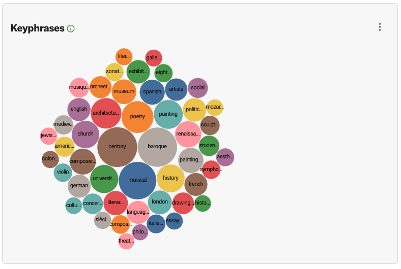
Keyphrases shows which content words are likely to appear than by chance around your keyword (in this case, it's still "baroque"). If you want to see how art historians specifically use 'baroque' you can adjust your parameters and get a list of words that reflects that particular scholarship. One particular benefit here is being able to download the underlying data and see how often certain words are being used in association with your keyword. Below, the term frequency graph allows users to see a google ngrams-style visualization of frequency over time.
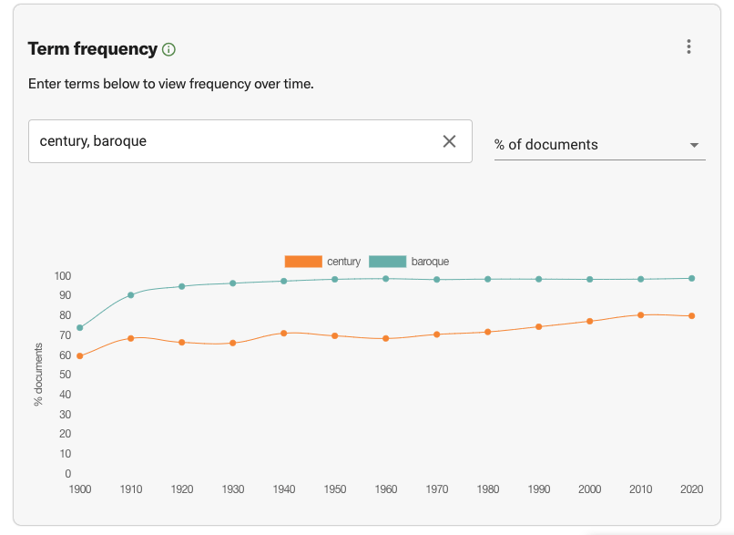
In this case, Constellate borrows the most frequent Keyphrase (or collocate) to provide a contrast, in this case 'century'. Since our source keyword for these visualization is 'baroque' it is understandable that it will be in nearly every digitized text. This graph operates much like the google Ngram viewer and provides a starting point to focus your attentions. For example, here it might be worth looking at the earliest documents (1900-1910s) to see what is accounting for the comparative lack of data for 'baroque' in the data.
Finally, Constellate provides a 'treemap' visualization that shows which disciplines (from the faceting list) use your term the most:
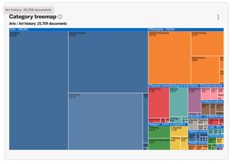
This tree map makes it clear that the majority (over half the visualization) is from "Arts", with clear and large divisions between the classifications of Literature, Performing Arts, and Art History. These are all disciplines where the descriptor 'baroque' defines a style or kind of art. Adjusting the disciplinary categories in the facets in the search on the left hand column of this page will adjust the shape and distribution of different disciplinary representation in this visualization. This particular visualization is good for helping pin-point which disciplines might be most useful to focus on (e.g. maybe not Law or Health Science, but perhaps Epistemology).